Living Room Inspirations (for my mom)
 |
| (Source) |
I found this post from Sherry over at Young House Love about avoiding being matchy matchy and yet still looking cohesive. She included these two photos above: the matching room on the left, and the more vibrant yet put together one on the right. The one on the right is so much prettier!! Well my mom was worrying that her living room is too neutral and dull right now (more like the photo on the left) and I wanted to show her some pictures I found on Pinterest. So here you go!
(She changed out the pillows and it's looking better already though!)
This room has similar tan sofas to my mom's and I love how the bright gold curtains and pillows liven up the space. I know my Mom wouldn't like the zebra print rug though!
 |
| (via Pinterest) |
This room feels more like my Mom's does, because it's not quite as modern as the other pictures I've included. I like the vivid artwork, the rust colored walls, and how the furniture doesn't match.
 |
| (via Pinterest) |
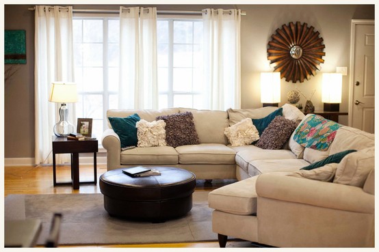
In this room I actually really like the white curtains! Maybe some sleek white curtains would provide a nice contrast to my Mom's taupe colored walls in her living room. I also like the mix of pillows, the round leather ottoman, and the glass lamp on the side table.
 |
| (via Pinterest) |
I don't like this room as a whole, but I included it because I love the simple
but stunning row of pictures on the wall.
 |
| (via Pinterest) |
And lastly, I thought maybe my Mom could get all her many picture frames
together and do a picture wall like this down the hallway.
together and do a picture wall like this down the hallway.
Mom if you want to recruit me for anything I'd be happy to help!

Comments
Post a Comment